
When most people think of branding, what immediately comes to mind is a logo or color palette. While I think that it’s truly what’s on the inside that matters most (AKA your brand message, persona, and voice!), having a strong visual identity is really important when it comes to establishing your brand.
The goal here is not just to create eye-catching graphics and a memorable logo, but instead to connect your brand messaging with the visual components of your brand in order to convey one, cohesive identity to the world.
Need help getting started? Here are the most important components when it comes to cultivating your unique brand identity.
Mood Board
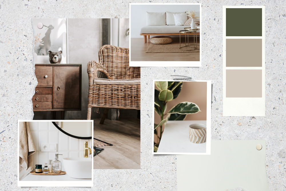
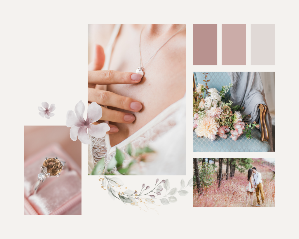
Mood Boards are an often-overlooked branding component, but I’ve found them to be so helpful! Essentially, a mood board is a mini visual representation of your brand. It’s often a collage of images that represent the vibe, personality, colors, and textures that will ultimately make up your visual identity.
A great way to create a mood board is on Pinterest, or if that’s not your jam, you can sit down with some of your favorite magazines and scissors to create a collage on paper. You’re looking for inspirational images that embody the tone and voice of your brand.
If you are working on creating a new brand from the ground up or revitalizing an existing brand, I definitely recommend starting with a mood board first! It will help you get clear on the visual aesthetic of your brand.

Logos
Another important component of your visual identity is of course your logo. Your logo is the main identifying mark for your business, so it’s not something you want to skimp on! Unless you are a professional designer, you should hire one to create this all-important graphic for your brand.
Typically every brand will have a primary logo that will be used most often and be the header for your website. For added flexibility, you can also have a:
- Secondary logo: Variation of your primary logo with elements rearranged or different color options
- Submark: A simplified, compact version of your logo that is very useful for social media
- Brand Pattern: Textures and patterns that complement your logo, and can be useful for print collateral or graphics.
Once you have your logo(s), make sure to write up a guide of logo do’s and don’ts for how your logo should be used, what colors are available, and how your logo can be modified. This will ensure consistent use of your logo across all your platforms by you and your team.
Color Palette
Colors evoke emotion, so it’s important to be selective about your brand color palette to ensure it is cohesive with the other elements of your brand. Consider the mood or personality you want your brand to convey and any feelings you want to evoke.
Do you want your brand to be calming and relaxing? Consider using greens or light blues. Or maybe you want to create a vibe that is playful, energetic, and powerful. You might choose to go with oranges, reds, or yellows.
There are literally millions of color combinations out there, so the sky’s the limit when it comes to selecting your brand colors! Working with a graphic designer can be very helpful in narrowing down your palette choices and ensuring the chosen colors all pair well together.
If you want to do it yourself, you can also use a color palette generator like Canva to find colors that go well together. A typical brand color palette will have 3-6 colors.
Typography
The last major component of your brand identity is typography. A brand will typically have no more than three fonts, which will be used on print and digital assets to create a cohesive look. I suggest picking a font for headings, body text, and possibly one additional font for accents. This should give you all the flexibility you need to create visually appealing materials that still look cohesive.
Again, a graphic designer can be very helpful in deciding the typography for your brand, as they are the experts in knowing which fonts pair well together. A general rule of thumb is to have your headline and accent font be more ornate than your body text font, which should be simple and easy to read.
Consider the emotions you want to evoke with your brand when selecting fonts. Is your brand sturdy and dependable? Or whimsical and free-spirited? Maybe your brand is clean and modern, or rustic and steeped in history. Whatever your brand attributes, your font should help convey these to your audience!
If you want more support creating a brand identity that stands out from the crowd – consider joining my 12 Week Branding & Marketing Intensive! I’ll be helping 20 individuals define their brands and learn how to DIY their social media, website, and email marketing. Enrollment closes this Thursday June 24, learn more here!